Imagine having the ability to spot hidden trends and make informed investment decisions. Well, technical analysis might just help you get you there. Technical analysis refers to the historical price data and volume data in decision-making, a popular stock trading technique employed by seasoned traders.
What is technical analysis?
Technical analysis is a method of analyzing stocks that relies on historical price and volume data to inform decision-making. Additionally, technical analysis isn’t just confined to the stock market alone; its utility extends across a broad spectrum of financial instruments such as foreign exchange, bonds, commodities, and much more.
It’s especially valuable for active traders who frequently engage in short-term stock trading, as they have a bandwidth to closely monitor price movements.
What does technical analysis focus on?
Whilst this is just an introduction and more research is needed, technical analysis focuses on these main areas:
- Price chart
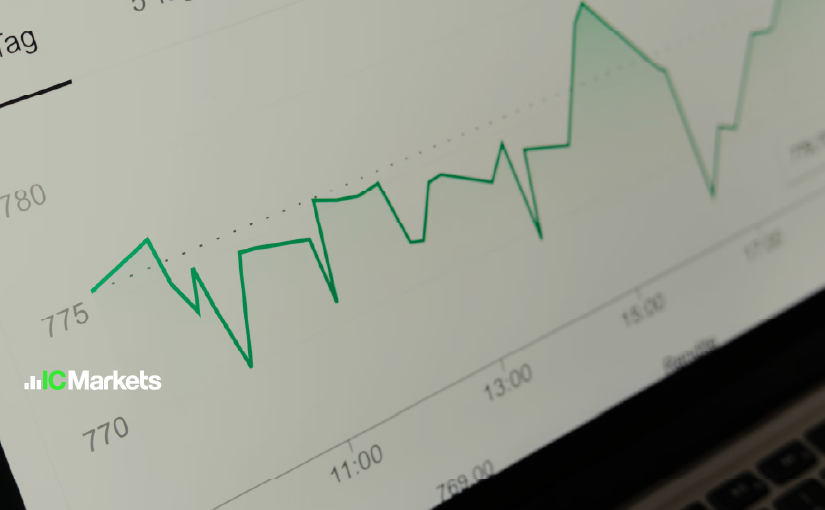
At the core of the technical analysis is the price chart. Essentially, it’s a visual timeline that tracks how a stock’s value has changed, for example, Woolworths Group. These charts come in various timeframes, spanning from daily snapshots to monthly vistas. They showcase key data points, including closing prices. Whether in the form of line bars, or candlestick charts, price charts serve as a rich source of information for technical analysts to decipher future price movements.

- Trend Analysis
This determines the prevailing trends in the asset’s price movement. Is it an uptrend, downtrend, sideways, or trendline? Recognising these trends is essential for aligning trading strategies with the broader market direction.
- Indicators
The technical analysis incorporates a plethora of indicators and plays a specific role in identifying and confirming trends in financial markets:
- Moving Averages: Smooth out price data and pinpoint trends over a specified time period
- Relative Strength Index (RSI): measures speed and direction of price changes, oscillating between 0 and 100. Identifies overbought or oversold conditions
- Moving Average Convergence Divergence (MACD): comprises MACD and signal lines, detecting momentum changes
- Bollinger Bands: consist of SMA and outer bands indicating standard deviations. They reveal volatility and potential reversals.
- Volume Analysis
In volume analysis, traders and analysts often pay attention to the following key concepts:
- Volume Indicators: Assess the trading activity or the number of shares traded during a specified time period, typically depicted on a price chart. They provide valuable insights into market dynamics and can be instrumental in confirming trends and identifying potential trend reversals
- Support and Resistance Levels:
These levels are key price points at which an asset often experiences shifts in buying or selling pressure, leading to reversals or pauses in price trends
- Support: specific price levels at which an asset tends to find buying interest and experiences a reversal of its declining trend. In other words, when the price of an asset approaches a support level, it is met with increased demand from buyers, preventing it from falling further
- Resistance: on the other hand, resistance are specific price levels at which an asset tends to encounter selling interest and experiences a reversal of its ascending trend. When the price approaches a resistance level, sellers become more active, creating a barrier to further price increases
Traders often use support and resistance levels to serve as entry and exit points, guiding traders to make more informed decisions in the financial markets.
- Chart Patterns
Finally, chart patterns are visual representations of historical price movements on a price chart. Here are some key chart patterns:
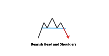
- Head and Shoulders
- Is a reversal pattern that typically signals a change in the prevailing trend. It consists of three peaks on the price chart: a higher peak in the middle (resembling a “head”) between two lower peaks on each side (resembling “shoulders”)
- Double Tops and Bottoms
- Double tops and double bottoms are reversal patterns that indicate a potential trend change. A double top consists of two similar price peaks, while a double bottom consists of two similar price troughs. A double top often signals a shift from a bullish trend to a bearish trend, while a double bottom suggests a shift from a bearish trend to a bullish trend. Traders look for a breakout below the double bottom or above the double top as confirmation of the pattern
- Flags and Pennants
- These are continuation patterns that represent brief consolidation phases within an existing trend before the trend resumes. A flag pattern is characterized by a rectangular-shaped consolidation period, where the price moves in a tight range, forming a flagpole on the chart. A pennant pattern is similar but forms a small symmetrical triangle during consolidation. Both patterns suggest that the previous trend is likely to continue once the consolidation phase is over.

- Triangles
- Triangles are chart patterns formed by converging trendlines. They indicate a period of consolidation and uncertainty in the market. A symmetrical triangle shows that buyers and sellers are evenly matched, and a breakout in either direction is possible. An ascending triangle often leads to a bullish breakout, while a descending triangle can result in a bearish breakout. Traders look for the breakout of the triangle’s trendlines to determine the likely direction of the next major price movement